NMDSGN
Category
Brand Creation
/
/
NMDSGN is the name of the clothing company I created (again) as part of a passion project alongside my A Level Graphic Design course. None of the products actually exist, and all these photos are purely mock-ups.

About the Brand
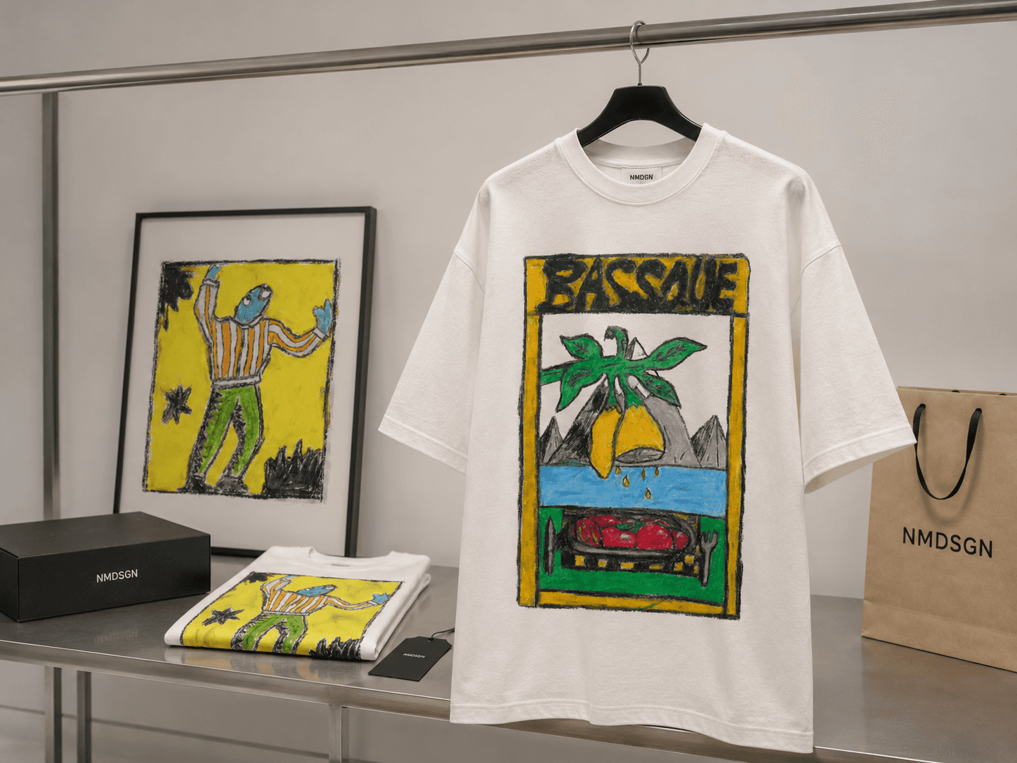
NMDSGN is a T-shirt company concept built around turning hand-drawn artwork into wearable graphic pieces.
The project explores how rough, expressive illustrations can be developed into a small fashion brand with a clear visual identity. Using the “BASSQUE” collection as the starting point, I created a series of product visuals that show how artwork, clothing, packaging and brand presentation can work together to create a stronger commercial concept.
All labels, packaging and of course the tshirt designs themselves are made by myself and imagined as a real product in the below pictures.

Visual Language
The visual identity combines bold hand-drawn artwork with a clean, minimal brand system. The T-shirt graphics are colourful, textured and expressive, while the surrounding brand elements are kept simple through neutral packaging, black labels and stripped-back typography.
This contrast helps the illustrations stand out while still making the brand feel considered and professional. It also shows how a rougher visual style can be presented in a more refined commercial context.
Product Presentation
These visuals help show how the designs could exist beyond a flat artwork file. The project considers the full customer-facing experience, from the graphic on the garment to the way the brand is presented online.

Design for Clients
This project reflects the kind of creative direction I can bring to businesses or independent brands looking to develop a stronger visual presence.
Through a project like NMDSGN, I can help with brand concepts, product mockups, visual identity, packaging direction, campaign imagery and website-ready visuals. The aim is to take an idea and make it feel more complete, consistent and ready to present.
Built from Artwork
The project began with physical drawings, giving the collection a handmade and imperfect quality. Instead of removing this texture, I used it as part of the brand’s identity. I was hugely inspired by Dutch artist Bob Mollema in this project.
This allowed the final visuals to retain the energy of the original artwork while still being adapted into a more professional product format. The result is a concept that sits between fashion, illustration and graphic design.

